
Most business owners judge their website by how it looks, not how it performs.
They structure their site to tell the world what they do but it isn't clear who they help and how.
People have enough going on in their busy lives to waste energy thinking through your website.
They’ve come because they have a problem and they're looking to discover if you can help them. They don't have time to translate what your company does into how it can help them. So they leave.
Remember, the primary goal of your website is to generate leads for your business. (For online stores, another goal is sales).
Your website needs to grab your visitors’ attention, entice them to keep reading and take action. Tell them what's in it for them.
Here are the five biggest website issues and how to fix them.
1. Your website is about you, not your customer
Most companies make themselves the central focus of their website.
They talk about how long they’ve been in business, their mission, their values, awards they’ve won.
People don’t come to your website to find out about you. They come because they have a problem and they want to see if you can solve it.
Make your website about them, not you. Show your visitors that you understand their pain and explain how you solve it.
If your website isn’t focused on your ideal customer, don’t expect them to stay and read about your business.

Basecamp’s website is focused on managers who are looking to transition their teams to remote work. They make the manager the hero. They highlight the problem they’re facing and explain how Basecamp can help them solve it.
2. The copy is generic, vague and boring
Most companies use the same generic words as their competitors.
They blend into the background and get ignored.
Everyone says they've got the fastest, most innovative, paradigm-shifting, easy-to-use, world-leading, cutting edge, dynamic and collaborative business.
These words have become generic. Don’t use them. Be precise instead.
Instead of: “Our industry-leading, result-focused agency can help you hit all your marketing goals.”
Try: “We build websites, landing pages and social media content to turn leads into customers.”
Use language that feels friendly, relaxed and approachable.
Even though your website will be read by thousands or even millions of people, it should still be written like you’re talking directly to one person. That's because reading is a solo sport. Every visitor reads your site alone.
3. The next step isn't clear
Too many websites leave their visitors guessing what to do next.
It’s not enough to publish pages of information alongside a Contact Us link on the top menu and expect your visitors to act.
Make it clear how they can take the next step in the journey with you by adding a clear call-to-action button, like:
- Get A Quote
- Call Us Today
- Schedule An Appointment
- Buy Now
Include a few of these on every page. For best results, put it in a prominent place, like your top menu.
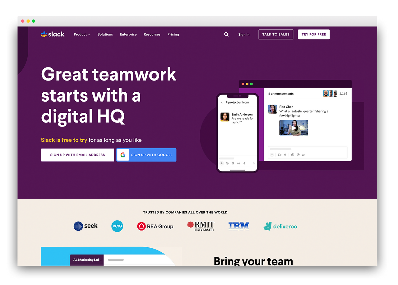
A good call-to-action (CTA) button should explain what your visitor will get when they click it. Slack’s homepage CTA is prominently displayed at the top of the screen along the menu bar. “Try for Free” explains exactly what you’re going to get.
4. You’re selling features when you should be selling benefits
One of my favourite marketing quotes comes from Harvard professor Theodore Levitt who said:
"People don't buy drills, they buy holes. If they could have the hole without buying the drill, they'd just take the hole.”
Most websites are selling drills when they should be selling holes. They write about what their products or services are, not what they do.
Here’s a trick I learned from Guy Kawasaki that will help focus your website on benefits.
Imagine a little guy on your shoulder asking you “So what?” after every point you write. For example, let’s say I’m writing website copy for Google for their Google Docs product, I could say:
“Google Docs is cloud-based.”
But then the little guy on my shoulder asks “So what?”
Now I have to answer what that means...
“Because it’s cloud-based, you can use it from any computer in the world with internet access. You can access it from your phone too. It also means you don’t have to install anything. And, if your computer gets stolen, you don’t lose your files because they’re all saved in the cloud.”
See the difference one little guy on your shoulder can make?

One of the most iconic ads of all-time, Apple didn't mention the features of the iPod. They didn't say it had 1GB of storage, but they did explain what that meant. i.e. you can fit 1,000 songs in your pocket. A great example of the power of focusing on benefits.
5. You’ve got no proof
Don’t miss the opportunity to show the world what you've done in the past.
Your website is an opportunity to prove what you’re providing actually works. Share case studies, success stories and testimonials.
Don’t hide these in a separate section of your website. Link them after you’ve explained the benefits of your products or services.
In other words, answer the little guy asking “so what” and then give him an example. Like this (following on with our Google Docs cloud feature):
“Here’s how Woolworths moved their 26,000 staff to Google Docs so they can work flexibly and seamlessly across states and office locations without disruption.”
Wrapping Up
A beautiful website is one that converts. Period.
Here are five common mistakes stopping you getting the most out of your site, and how to fix them:
- Your website is all about you, not them. Make sure your home page identifies your potential clients’ problems and tells them how you solve it.
- The copy is vague, generic and boring. Avoid words that everyone uses and make your writing clear, direct and conversational. Formal language is appropriate in some circumstances, but not online. You’ll engage more visitors if you write like you’re having a conversation.
- It’s not clear what the visitor should do next. Make it obvious what your visitors need to do to move closer to working with or buying from you. Include clear calls to action buttons on your pages and consider adding one to your header menu.
- You’re selling features, not benefits. Sell the hole, not the drill. Imagine the little guy on your shoulder asking “So what?” and give the answers.
- You haven't shown proof. Tell your visitors how you solved similar problems for other clients.
Fix these and you'll turn visitors into leads and customers.
No spam, unsubscribe at any time.